
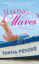
Though I'd reviewed drafts of the cover before that, seeing it on those sites was my first time glimpsing the final version.
Or was it the final version?
There was a little confusion, and ultimately, my editor assured me it wasn't. The cover posted on those sites was the cover for the Advance Reading Copies (ARCs). The final version would be a little different.
And yesterday, I got to see the final final version.
Here's a look at the two versions side by side:
 If you want to see detail, click the image to make it bigger. You'll definitely want to do that if you'd like to enter my contest to win a signed copy of the ARC.
Here's how it works: study the two covers and make a list of the differences you see between them. Leave a blog comment naming all the differences. To keep things fair, I've turned on comment moderation and won't post any of your entries to the site until the contest closes at 5 p.m. PST on Wednesday, December 21. That way, you can't see each other's entries until the end.
The person who finds the most differences between the two covers will win a signed ARC of Believe it or Not. In the event of a tie, I'll draw a name at random among the finalists.
Sound fair?
OK, let the cover study commence!


62 comments :
Well I tried but I only found 11 differences...
1. Tawna Fenske is is Yellow on the Final and Pink/purple on the draft
2. There is a yellow design below the title in the final and not on the draft
3. The draft is much darker so you can see more detail in the sky via clouds and much lighter in the final
4. The quote on the draft and on the final are differnt. The draft has one from New York Times while the final is from RT Book Reviews
5. The way the black letters are wrote in the bottom right cornor are different on the draft then on the final version
6. You are able to see a good inch lower on the final version then you were on the draft which lets you view the bottom of the walk and the mans jeans.
7. The guys left hand is visibal in the draft version but not in the final version.
8. The nomination for Best Contemporary Romance is on the final version and not on the draft.
9. The letter style for the title is different in the draft than in the final version.
10. My opinion the guy looks chubby in the draft more and not in the final version.
11. You are also able to see a few inches more to the right giving you a view of a second wood post on the walk in the final and not in the draft.
Here goes. In the final version:
The people are paler.
The man's jeans are visible (boo!)
Your name is yellow instead of dark pink.
The tag line has been rearranged.
The dock has been shifted---two posts are visible and less edge.
There's more sand on the dune.
The water isn't as visible.
The blurb quote has been changed. It has more lines and might have been lowered slightly.
There's a yellow flourish between the quote and the title.
The font on the "Believe It or" is different.
The "Not" isn't poking into "Believe" anymore (ahem)
The colors of the grass are muted.
The dock has been highlighted blue.
The man's left hand has disappeared. Or possibly the woman's right hand, but I think it's his.
Whew!
OK, here goes:
* Your name is now gold.
* Added a gold swish under the title
* Changed the blurb
* Changed the line breaks on the tag line
* Lightened the entire image
* Added jeans to the male model
* We can see more of the dock the subjects are sitting on
* The title font is slightly different - at least for the Believe It part
* I think they added more 'happy trail' hair to the male model :)
* Your name now appears lower than in the first version
* *peers closer* Yep. There is definite nipple in the new cover. Original only had areola :)
* Your last name appears bolder than your first.
* I'm not sure what I'm seeing, but I think there's an extra hand in the first cover that's been removed in the final one. Where the models are holding the card...
That's it for me! Congrats, Tawna!
While I really suck at this game, I'm dying for a copy of Believe it or Not! Especially one signed by you--I assume there will be a ribald comment along with your signature? Woot! So, here goes:
*Old Cover's darker--darker (tanned? Sun-damaged?) people, darker sky, darker dunes and boardwalk
*"Believe it or" and your name in different fonts
*Different blurb on the front (author vs. RT Book Reviews)
*Final has yellow swirly thing between title and blurb
*People look like they're in soft focus on old cover vs. a bit clearer on final
*Has his belly been photoshopped to be a bit taughter on the final? (this might just be that he's no longer in soft focus...)
*He's more than just a floating torso! He has on jeans in the final
*His left arm/hand has disappeared in the final
*Your name's yellow on the final
*Two rungs are visible on the boardwalk's handrail in the final vs. one on the old cover
*The boardwalk looks higher on the final, which might just be because the bottom 1/8th of the old cover's blurred out. Speaking of...
*The bottom 1/8th of the final is visible and not blurred out
*your tagline "The last thing..." is laid out differently
*Your name is lower on the final
*there's less sand and more dune on the final
*The white splotch above her head is gone
*A little more of the boardwalk is visible
Okay. That's all I can see. But I'm curious, what's the picture she's holding? Looks like a person but I can't tell exactly...maybe a younger her?
Oooh, fun!!
Okay.
1. The whole thing is light/more exposed (heh). I'm not sure if this counts as the same thing or not, but most of the clouds are gone.
2. The font changed.
3. Different praise for Making Waves.
4. Your name is a different colour.
5. That squiggly thing under "Not" wasn't there before.
6. He has pants now.
7. The logline or whatever it's called has different woding.
8. They used a tiny bit more of the photo so you can see more of the fence boardwalk thingie.
9. He aparently now has no left arm... so there's a gap above her knee.
10. I think some of the grass right behind them was altered a bit because that white smudge is gone.
Okay, that's all I'm seing :)
Oh, and Laina1312@gmail.com if you need it.
"Believe it or" - different font.
His jeans show up in the final, not the draft.
Gold curly-Q in final
Different quote used in "Praise for Making Waves" from RT Book Reviews
Alignment changed in "The last thing she needs..." - needs in on 2nd line in final.
Tawna Fenske in gold, not pink
Lighter in final version (skin, grass look paler)
Second post in pier showing in final.
Like the final cover! Congrats, Tawna!
1. See grass thru arms now
2. His left hand now open
3. He's wearing jeans now
4. Overall color is lighter
5. He doesn't look like he has a potbelly now (sorry!)
6.Your name is different color
7. Your name is smaller
8. Your name is lower on cover
9. Title is larger
10. Title typeface is different
11. Swirly thing under title now
12. Tag line changed - needs moved to line 2
13. Quote for Making Waves changed
14. RT and nominations added below quote
15. See 2 posts on boardwalk now
16. Can see under boardwalk now
17. His hair sticks out by his ear now
18. Lines around his mouth now
19. His face is shiny now
20. Less of a white blob behind pier
21. No longer see "ocean" to right
22. No white space over her head
23. His right nipple looks 2 different colors now
24. Her cheeks more defined now
Okey, here goes ...
In the final cover:
1. The 'Believe it or' part of the title is in a different font and ...
2. ... slightly larger.
3. A yellow squiggle was added between the title and praise for making waves which ...
4. ... moved the praise for making waves down slightly.
5. Different actual praise was used.
6. A second pillar/post can be seen on the right hand edge of the cover (previously it as blurred out.)
7. The planks on the walkway are blue, not brown.
8. The bottom structure of the walkway can be seen. (Two posts previously blurred out)
9. The word 'needs' has been moved down a line.
10. Tawna Fenske is in a smaller font size and ...
11. ... yellow.
12. Cover dude is now wearing jeans.
13. They helped the cover couple lose the self tan and generally lightened them, and the background and the card she is holding and everything really, up.
14. Cover dude has lost an arm!
15. The sun is no longer blazing right above cover girl's head.
16. Background image was moved slightly up and to the left relative to the cover couple.
Plus two things which I am not sure counts:
1. Nomination for an award was added (possibly this is simply part of the different praise mentioned in 5).
2. Both title and author name seems less fuzzy (possibly simply a function of picture quality?)
I just know I am going to spot something obvious the moment I post this comment :)
Okay...deep breath...
-The fonts for "Believe it or" are different
-And darker color on right
-And capitalized in one on the right
-Little symbol under title on left
-The quote is different
-the formatting for "the last thing she needs..."
-Guy on right isn't wearing pants (SCANDELOUS)
-Color and size of your name
-The figures on the right are clearly photoshopped -- skin colors, muscle definition, hair, faces, eyebrows, all done up to make them look younger and all US Weekly-y.
-He has NO LEFT ARM
-Lens flare to right of male's face
-Lens flare above female's head
-Background photoshopped and blurred on right (makes the grass greener, etc)
-Darker sky on right
-Position of the dock is higher on the left (with more railing visible)
-The gradient under your name on the right
I think that's it! Phew.
:cough: I really want your book. So:
in the final version
-the font in the title is different
-the font in the title is smaller
-the color of your name is different
-they added a sigil above the blurb
-the blurb is different
-you can tell he's wearing pants
-you can see two posts on the pier instead of one
-the color is lighter
-more grass
-the tagline is laid out differently
-your name is lower on the cover
-the bottom of the cover doesn't fade out
-it looks like your name is smaller but it might just be the lighter color
Believe it is a different font and larger in the final version
your name is a different color and looks larger in the final too
underneath the title there is a gold thing that is not on the draft
and the quotes underneath are different
in the earlier draft, background behind the title is bluer and below the testimonials looks different too
it looks like the guy in the draft is naked or he's wearing beige pants and in the final he's wearing blue jeans
the people look darker too in the draft version
in the final the last thing she needs is not bold but in the draft it is
sorry but why does the final look faded compared to the draft???
Here's my take. This reminded me of the Sunday comics where you had to find the differences between pictures every week. :D
Final version:
-Sky is lighter blue
-People are less airbrushed/more gritty
-People are paler
-Man is wearing pants (and no longer looks nekkid)
-Little yellow flourish between title and quote
-Font changes for "Believe it or"
-Quote is different
-In tagline, "needs" is moved to second line
-A little more of the dock is visible on the right (i.e., extra railing)
-Author name is smaller
-Author name is colored yellow
-His left hand is removed
-Dunes are lighter
x♥x
Noelle
Ooh, fun! Okay:
- The font for "Believe It Or" is different
- The new one has a squiggly yellow thing under the "not"
- There is different praise, from a different praiser
- The boardwalk is rearranged differently: now you can see two posts and underneath it, and some of the sand on the uneven boards near the posts appears to be swept off
- The dude's gained some pants and is no longer a floating torso above the boardwalk
- Your name is in a different color font
- The breaking of the tag line is different, cutting off after "she" as opposed to "needs"
- I don't know if it really counts, but the photo itself is a lot more desaturated than earlier, which allows for more detail like a second lip and a treasure trail, and what appears to be lighter eyes for your hero
- Your heroine appears to have lost her right hand. That's kinda tragic.
Congrats on the new book!!!
I definitely prefer the final version. I especially like the gold text and little swirly thing.
Speaking of which? Differences:
- Gold swirly thing.
- Gold Author's Name.
- Image stretches to the bottom.
- Image contains hunk's jeans.
- Less color saturation on the image.
- Hunk's happy trail more visible.
- Hunk's chest hair more visible (props on the chest hair)
- Different font "the last thing..."
- Shadow behind the font on author's name
- Different font on first part of the title
- Different font on blurb.
- Different blurb.
I could probably go on.
Wow. That was surprisingly fun. Like one of those activity books.
Ooo! Fun. I feel like I'm playing with a Highlights magazine back in my childhood dentist office.
Let's see...
- The font is different on "Believe It Or"
- The sky is bluer on the Amazon edition
- The frame is narrower on the Amazon edition - so you see one pillar on the dock instead of two
- You can see his pants on the final version, not the amazon version. (also more of the dock)
- They're more orange and soft focus-y in the amazon edition.
- The final version has the little yellow squiggle under "Not"
- The 'Praise for Making Waves' is a different quote on each
- The color of Tawna Fenske is different
- The layout of the "The last thing she needs..." text is different
I think that's all I got. But thanks, that was fun :)
1. The font for Believe it or is different.
2. The final version has a symbol between the title and the quote.
3. The praise for Making Waves is different.
4. The background is lighter in the final version.
5. The models aren't as tan in the final version.
6. The wording of the tagline is separated into the three lines differently.
7. Tawna Fenske is in a different color.
8. The guy is wearing jeans in the final version.
9. Behind your name is blurry in the earlier draft while the final version is clear.
10. There's no sun above her head in the final version.
-The first three words of the title have been lowercased.
-The first three words of the title are in a different font.
-A graphic has been added between the title and the MAKING WAVES blurb.
-The MAKING WAVES blurb is different, and by a different person.
-"The last thing she needs..." line is formatted differently.
-The font color for your name is different.
-Your name is lower and smaller.
-The colors are lighter.
-The boardwalk in the background, on the right side, looks like it has an additional step.
-We can see more of the boardwalk path, including the post(?) in the bottom right corner.
-The male model is wearing jeans now.
-The landscape in the background has more grass.
-The female model is no longer making a fist.
-There is less space between the blurb and the top of the landscape.
-There is space between the female model's arms and knee; the original does not have that space.
How fun! Here's what I noticed...
- The filter/saturation of the background
- The font of the first three words
- The capitalization of the first three words
- The golden squiggly thing
- Different praise
- The alignment of the line at the bottom
- The color of your name
- The filter/saturation of the characters
- The man is now sans pants (as he should be)!
Merry Christmas, Tawna!
Differences:
Title font: 'Believe It or' is a script-like font on the final and a block all-caps font on the earlier.
Cute little gold swirly curlique between title and blurb on the final version.
Blurbs are different on the two covers.
'The last thing she needs is a guy who knows everything...' is broken between different words on both covers.
The author's name is in different colors and a slightly smaller font (and lower placement?) in the final version. (if it matters, I think the pink stands out better than the gold.)
The hero's pants are airbrushed away on the earlier draft (and so are his legs and other important equipment).
The color is more saturated on the earlier draft.
The background behind the heroine's hands shows more grass and less sand in the final version.
Nice cover either way!
Okay here is what I got.
#1 The final cover is brighter over all.
#2 Has the yellow swooishy thing under the title on Final
#3 Title font is different on Final
#4 Quote is different on Final
#5 the little blurb from the book is in a different format on the Final
#6 Your name is different color
#7 You can see his jeans on final
#8 You can't see his right hand on final.
#9 they are less tan on final
#10 Hair color is lighter on final
#11 Can't see ocean as well in Final
#12 You can see under the walkway on the final
#13 you can see to of the posts on the hand rail on final
I think that is all I have.
Thanks for a chance to win Tawna.
Kelly
Books-n-Kisses
Text at top switched to upper and lower
doodad under title
different praise comment
background photo has been placed differently
background photo repainted with different grasses and a hard edge under deck
author title color changed
author title size changed
blue jeans appear on male model
coloring on models more natural
detail on models sharper, not fuzzed- much detail in hair
lighting in sky is flatter, lighter
appearance of ocean in background not as apparent
male model's left hand and arm has disappeared
The final cover is different because…
“Believe it or” no longer in CAPS.
The addition of that little gold filigree hicca-ma-bob
The quote for Making Waves is different
“The last thing she needs is a guy who knows everything” placement is altered slightly
They lost their orangey-Snooki tans! Actually, the entire image got dialed down a bit.
I think I like the guy in the previous version better…or not. I can’t decide. He was Curtis Stone but now hovering around Val Kilmer…or wait… that guy from The Mentalist.
He’s wearing jeans instead of his torso vanishing at the bottom of the book.
Tawna’s name is gold instead of pink.
* Title font changed
* All caps on title removed
* Squiggle added below title
* Quote below title changed
* Photo color and sharpness adjusted
* Pants visible on male :(
* Font of "The last thing..." changed to bold
* Font of author name bold and different color
* Background box removed behind author name
"Tawna Fenske" is in yellow, instead of pink.
The guy's wearing pants now. Both models are incredibly paler than their orangey, not-final past selves.
The sky and background has been lighten out, but the boardwalk's edge has been more defined and darkened.
The first praise is from Lani Diane Rich, while the final version has praise from RT book reviews, both for Making Waves.
The boy model's left hand isn't in a fist like the not-final version.
His hair is lighter, as is hers.
There's a little yellow swirly thing between the title and praise from RT book reviews.
The tarot card (?) has been lighten, too.
Here are the differences I noticed...
Your name is a different color, the guys pants are jeans now, The quote is not from Lani anymore, the gold design above the quote is added, The colors are muted on the new one, (or my computer sucks more than I realize) You see more of the dock on the new one, extra post,guys belly was airbrushed skinner ( I am grasping here, I really want a ARC!!!!) Can;t see the guys hand behind the girl.....Font for title is different.
Here it goes:
In the final version:
couple is not as tan
he has on jeans
your name is yellow, not pink and written lower
not as much white beside dock - more grasses
different quote
swirly little gold thingy above quote
spacing of "The last think she needs. . ." is different
Font for title is different - lowercase letters are now used
his left hand isn't showing
photo she is holding is lighter
All in all, I like the final version better - I think the font is nicer for the title and the hands were confusing when you really studied them. I also like the fact that you can see his jeans - much sexier than dissolving into nothingness. . . .
Fun contest! Thanks!
Karen Lawson
Oops!! one more thing - the final cover isn't as blue as the first!
Thanks!
Karen Lawson
1. The color--the final version has a cooler blue tint and the earlier draft has a red tint.
2. The little teaser "the last thing she needs.." is justified in the final version, and centered in the earlier draft.
3. Your name went from pink to yellow.
4. The male model's left hand has disappeared in the final version.
5. The blurb changed from one by an author whose name I can't make out (I may need glasses) to one from a book review.
6. The male model is now in jeans instead of having a floating torso.
7. There's a squiggly image separating the title and the Making Waves blurb in the final version.
8. The lighting is sharper, so that you can see more details on the models in the final version. It doesn't have the soft glowy lighting from the previous draft.
9. The title's font changed for the "believe it or" section.
10. The background image was raised, and you can make out more of the bridge.
11. The background is paler, and there isn't as much contrast between the blue of the sky and the white of the clouds, or between the green of the grass and the brown sand.
12. You can't make out as many details on the card she's holding in the final version because it's paler. In the earlier draft there seems to be writing on it, but it's barely visible in the final version (at least to my poor eyesight)
13. There's a space between the model's arm and leg where you can see the background behind her in the final version.
14. The slats on the bridge seem straighter in the final version.
15. The font of your name is slightly smaller in the final version
16. The font of your name has a shadow in the final version that it didn't have in the earlier draft.
Well, that's all I can see. It will be interesting to see what others noticed :)
(sorry if this posts twice, my computer and I are in a fight)
I like the final version, they look less spray tanned and the guy actually has pants on, though I may like that a little less…
Let’s start from the top.
The title went from:
1)Caps to lower case
2)Different font for the first three words
3)The B in Believe and curl of N in Not are sitting at different places in relation to the guy’s head
4)The sky is lighter
5)There’s now a little yellow thing under the title
6)Different quote
7)Quote has been reformatted
8)Quote’s from a different person
9)Nominations for Making Waves are shown
10)You can see more of the end of the dock
11)The beach is closer to the quote
12)Looks like more sea grass grew
13)The dock looks less like it’s about to fall apart
14)The entire background is more washed out
15)They people are paler
16)I still can’t tell what she has in her hand
17)Your name is a different color
18)It’s also a different font/thinner letters
19)He has pants on
20)I think I can see his boxers
21)The tagline is reformatted
22)There’s now air between her left knee, him, and her arms, so I’m no longer wondering if this is about conjoined twins
23)There’s one less hand by her left knee
24)I can see more of his right hip bone
25)Same goes for the happy trail
26)His hair comes down farther on his neck
27)He looks a bit less like that guy from the Mentalist
Ooo, I forgot how fun over analyzing things can be. Love your blog!
1) Final version is "lighter" in color (not as tan).
2) Title in final version is not capitalized while the draft version is capitalized.
3) The three first words in your title are in a different FONT style in the final.
4) Final version has those squiggly lines above the blurbs. Draft does not.
5) Final version has a different blurb by a different sourse. Draft is blurbed by a person while the final draft is blurbed by FT Book Reviews.
6) The guy's left hand seems to be missing in the final version.
7) The boardwalk is higher, lighter (more detail) and the side posts of the boardwalk are more visible than in the draft.
8) The guy's face isn't as glowy in the final version whereas in the draft his left cheek and hair are almost washed out.
9) The lady's hair (top) isn't as halo'd in the final version.
10) The guy actually has pants in the final version. In draft it sort of appears that is torso is completely cut off from his bottom-parts. :)
11) The grass in the background in the final actually looks like grass. In the draft it is a green fuzzy blob that escaped from my fridge.
12) The quick tag line "the last thing she needs..." is spaced out and written differently between the two versions.
13) Your name is in a different color.
Okay, first off, Congratulations. This is awesome.
Here's what I noticed.
1. The font for the title is different on each cover.
2. The yellow scroll under the title isn't on the earlier draft.
3. The "Praise for Making Waves Comment is by a different source on each cover.
4. You don't see the blue of the sky on the final cover.
5. The male model looks like he isn't wearing pants on the earlier cover.
6. The saying: "The last thing she needs is a guy who knows everything" is in a different size on each cover and looks like its in bold on the first one, but that could just be my monitor.
7. The couple on the cover look farther away on the final version than on the first one.
8. The women's right hand has been air brushed out of the final version.
9. Part of the boardwalk is missing on the first cover but you see more of it on the final.
10. Your name is in different colors on each cover.
11. Your name is in different fonts on each cover.
Just so you know I am wishing myself Good Luck. My bestie Karla Nellenbach is a huge fan. I mean HUGE. She loves you, so if I win, I will be sharing this with her. Not that that should sway your opinion, I mean this is a contest based on fair and square so if someone else were to have more comments than me, it wouldn't be fair to erase some of them. Would it? No, it really wouldn't, but if an extra ARC happened to fall off a truck close by...I'm just saying is all.
Happy Holidays.
Wow.. so much swoon.. okay...
The earlier draft:
*Has all caps for "BELIEVE IT OR";
*Doesn't have the wavy lines under the title;
*The blurb quote is different;
*The logline is centered differently;
*Their skin tone is darker;
*Sexy dude has an extra hand showing;
*The tarot card is darker (is it a tarot card?);
*Sexy dude looks nekkid (yaaay);
*There is less of the pier showing;
*There is less grass showing;
*Your name is in different colors...
AND... which ever it is, it looks AWESOME!!
Different printing of Believe it, gold swirl under the word not, different reviews, RT book review, softer color, different color of your name. his pants are a different color. Different layout of words above your name
Ooh! I love this game!
1. "Believe It or" are different fonts.
2. The tonal quality of the covers are different, with the final cover having a more bleached out appearance. (I could probably stretch this out to at least five differences if I have to.)
3. The details on the couple are sharper. You can now see his facial and belly hair. ;)
4. "Tawna Fenske" are different colors.
5. The male model is wearing jeans in the final cover. He might be naked or legless in the ARC.
6. The sky is white in the final, and blue with clouds in the ARC.
7. The blurbs are different.
8. There is flourish beneath the title in the final.
9. The angle of the dock is different (you can see more beams on the handrail in the final).
10. The picture continues to the bottom of the cover on the final, rather than being white as on the ARC.
11. "The last thing she needs is a guy who knows everything..." is formatted differently on the final.
12. They have erased the guy's hand on her leg on the final.
13. There is a gap between the woman's arms and leg in the final that isn't in the ARC.
I hope that's enough . . . :)
different printing of Believe It. Gold swirl under the word not
Different reviews
Softer color
Different color of your name
Different color of his pants
Different layout of words above your name
RT book review
Let's see. The skin tones of the couple are lighter (which makes the guy look hairier), the background is lighter and more detailed (especially the dock), the guy is wearing pants (boo!), your name is yellow instead of pink and is slightly smaller and lower on the cover, the font for "Believe It or" is different and it's not in all caps, the yellow designy thing (technical term) under the title is new, a different review of Making Waves is used, and the tag line is laid out differently. That's all I got! Send me an advance copy! :)
1. The font on "Believe it or" has changed.
2. The final version includes a flourish between title & the cover quote.
3. The quote beneath the title has changed.
4. The couple's skin tones have been lightened.
5. The man in the photograph has been given pants.
6. The boardwalk has been extended so that you can see all the detail, instead of fading out at the bottom in the earlier draft.
7. The tagline has been repositioned so that "needs" is on the second line, not the first.
8. The boardwalk in the final version has been moved in a way that part of the beach has either been covered with grass or the boardwalk.
9. In the final version, two rails on the boardwalk can be seen, as opposed to one in the earlier draft.
10. The font color for "Tawna Fenske" has been changed.
11. The blue sky has been lightened in the final draft.
12. The final version does not have any "fuzzing out" of details on the very bottom of the cover, like the post of the boardwalk.
13. In the earlier draft, there's a sunspot on the very far left corner that doesn't appear in the final draft.
14. In the final draft, the man is now missing a hand. In the earlier version, it was resting on the woman's knee.
15. In the final draft, there is no horizon line beyond the grassy beach area.
16. The photo in the woman's hand has been lightened so the details are not as noticeable.
17. "Tawna Fenske" is now positioned lower on the cover in the final version, and is of a slightly smaller font.
18.
Okee dokee! I believe I've come up with 57 different things..... hell, I keep adding things. I give up. You'll want to count anyway. lol
Title:
Title font changed.
Title size changed to larger in final.
Title in caps (draft), lowercase (final)
No golden scroll below title in draft.
The "N" in "Not" touches the "I" in "IT" (earlier)
"Not" doesn't change in either version, except for
being moved down a bit out of the top line.
Praise changed:
draft: 5 lines
Final: 6 lines
nominations mentioned in final
RT choice mentioned in final
Solo author mentioned in draft
Type is set lower (final)
Description blurb: ("The last thing she needs...")
Different line breaks
Bold in earlier draft
Not bold in final
Author's byline:
Author name in pink (earlier)
Author name bold (earlier)
Author name different font (earlier)
Author line higher (earlier)
Author line not on male model jeans (earlier)
Author name color matches male's hair color (final)
Author name color matches scroll under title (final)
Photo:
Color saturation (earlier)
Models look tan (earlier)
Sunshine glare, top left corner (earlier)
Blue skies (earlier)
More island/land/trees/mountain? seen beyond the
pier (earlier)
No pier post below pier (earlier)
only one post/hand rail on pier (earlier)
Two handrail posts on pier (final)
One post below pier (final)
No water under pier (earlier)
Water under pier (final)
More water glare above pier (next to hands) (earlier)
Grass seen between arm/leg of female (final)
Models appear closer in earlier
Bottom of cover is blurred w/color of pier (earlier)
Different color pier
Less Pier board detail (earlier)
Less amount of pier boardwalk (earlier)
Body tones of models go with the color of author's
name color. Pinkish (earlier) yellowish (final)
Female:
Hair detail/ texture lost (earlier)
Nose outline lost (earlier)
More texture/detail (final)
Sun glare down to almost her forehead (final)
Male:
No jeans on male (earlier)
Face looks sunburned (final)
Face/cheek has sun glare (earlier)
"Happy trail" faint (earlier)
Chest hair faint (earlier)
Facial hair faint (earlier)
2 left hands of male (earlier) One looks as if it's
holding her right hand, his other looks as if he's
also holding the photo.
Arm rests upon her leg (earlier)
No arm resting on her leg (final)
Does he HAVE a left arm? lol
There's a dark line (possibly left from jeans that
shows in earlier.
Don't see as much of his hair curl on his left side
(earlier)
I can't believe people get paid for knowing how those tiny changes mean big bucks.
So, here’s my list:
Final version:
* No longer has “Believe It Or…” in all caps.
* Has changed the “Believe It Or…” font
* Has adjusted the “Or” and the tail of the “Not,” so that they align differently
* Put a nifty little loop-de-loop under the title
* It might not be as “Hilarious! Wild! and Sexy!,” but it is Delightfully Witty and will have us Laughing Out Loud.” (aka, the praise is not from Lani Diane Rich any longer, but from RT Book Reviews and now includes your big win!!)
* Changed the font (and spacing) on the tagline
* They put jeans on him, making it look less like he was nekkid under Tawna (a disappointment, I’m sure)
* They changed your name, making it a different color and also giving it that shadow effect. (personally, I liked it the same color as the title, but I imagine it blended into his newly-clad crotch that way)
* OK, now I’m not sure if these others are real changes or more just the pictures, but the coloring is different – the picture itself – the lighting is different (more) on the final version. It’s clearer that he needs a shave and has bad highlights in the final version. Her part is more obvious, he seems to be sucking in his gut more (see that definition along the side?) and his happy trail is more obvious. But I think that is all just lighting/contrast. Also, the sky is bluer and has a bit of clouds in the old draft. And I can see two posts on the dock in the final version.
I think that whole last point is all lighting/cut issues and not really something different, but maybe it counts.
Um, two words: SPRAY TAN
In looking at the final version --
1. The models are lighter in color (like the contrast was lightened)
2. There's a yellow squiggly line beneath the title
3. "Believe It Or" from the title are in a different font
4. The praise blurb is different (final is RT quote, ARC is Lani Diane Rich)
5. Words are spaced differently "The last thing she needs..."
6. Author name is yellow instead of pink and slightly smaller font (unless you count this as 2 things)
7. Male model's jeans show in final version
8. Also in final version, you can see more of the dock/pier -- you can see 2 posts on the right side of the cover (on the ARC, you only see 1 post)
Man on left produces adult films.
Man on right produces nonfat breast milk.
Man on left lost his virginity at age 15.
Man on right lost a court case which found him guilty of statutory rape.
Man on left experiments with drugs.
Man on right experiments with boys.
Woman on left was an award-winning gymnast.
Woman on right can fit her entire fist inside her anus.
Woman on left donates to United Way each year.
Woman on right only swallows the semen of Hispanics.
Woman on left has an egg allergy.
Woman on right can palm a racquet ball with her vulva.
Oh man...I love find-the-differences games. Let's hope that doing this at almost 1 AM won't kill my observational skills. ;)
1.) Different font for the first part of the title.
2.) The people are slightly pinker in the earlier draft.
3.) There's a fun little symbol between the title and the praise
4.) Different Making Waves praise blurb from different source, now including your nomination.
5.) You can see the lines in the guy's face more in the final version, plus there's no lens flare next to his face in the final.
6.) The whole picture is moved up/zoomed out slightly in the final version, which leads to different placement of the pier and horizon in the background.
7.) The placement and layout of the tagline is different.
8.) The font size and color for your name is different (smaller and now yellow in the final).
9.) Don't know if this will count, but the grass is greener in the earlier version, but that's due to the same color issue that made the people pinker.
10.) There's a hand/fist (presumably the guy's) in the earlier draft that isn't in the later, just behind the girl's hands.
12.) The zooming out/shifting of the picture means that there are now two posts on the pier railing instead of the one.
13.) Most importantly, the guy actually has pants (and a lower body) in the final cover.
And "importantly" in the last one was almost "imporntantly." Subtle difference, but fitting and I thought you'd get a kick out of it. ;)
ok, heres my try. amazon draft:
*has a sun(?) in left corner,
*the sky is really blue with clouds,
*'believe it or' is different font and uppercase.
*The curved point on the 'N' in the title 'Not' touches the 'I' in 'It'
*both characters on the front cover have darker hair color
*Both characters on cover are tanner
*the guys nipple is darker
*the card(?) in the womans hand is darker
*you can see an island or boulders (not sure which it is) and water and more sand
*the yellow squiggly line under the "not" in the final cover isnt on the amazon cover
*the writing under the 'not' in the title isnt the same, different words
*the color of your name on the cover is different
*the man looks more stockey, bulky in the amazon cover (could just be his tan)
*the man is missing his jeans
*the boardwalk is different, looks unstable and like the planks are all over popping up everywhere
*the boardwalk doesnt have 2 posts
*the boardwalk is a different color
*the guys arm is on her leg
*the words above your name is different, its darker and in different format
*the cover is cut off where your name is
*you can see more sand
*the guy has a tan line by his jeans in the final version cover
*theres sun 'blind' spots on the cover where the sand and grass is
*the posts on the boardwalk are a different color
*the grass is more green and lush
*theres no post under the boardwalk
*it looks like the right side of the cover is cute off a bit
*theres no wood post under the planks holding there together
*in the final cover the man has a curl on the right side of his head
*the color of the womans lips are a bit darker
*are the posts on the boardwalk in the final cover round? where the amazon ones are rectangle?
thanks for the fun! congrats on your release! it looks great! ;) happy holidays!
shadowluvs2read(at)gmail(dot)com
Oh, I love these games! Okay, here we go:
Your name is in yellow on the final version, pink on the draft version.
Your name is lower on the final version than on the draft version.
Your name is an eensy bit smaller on the left than on the right.
The guy is wearing jeans on the left, but the bottom of the pic is blurred out on the right.
The title has a different font in the two versions. The “Not” is the same, but “Believe It Or” is all caps on the right and title case on the left and the font is different.
There is a little yellow design below the title on the left, but not on the right.
The sky is a darker blue on the right than on the left.
The skin tone of the models is darker on the right than on the left.
The words above you name “The last thing she needs …” are different – on the left “needs” is on the second line; on the right, it’s on the first line.
Those words also look darker on the right version.
The fence and boardwalk are cut off earlier on the right. (You can see two posts on the left, but only one on the right, and you can see more planks on the boardwalk on the left.)
There is more white space on the grass on the right (near the girl’s hand) than on the left.
The boardwalk is grayer on the left, beiger on the right.
The blurb is different. On the left it says, “Delightfully witty …” on the right it says, “Hilarious …” and the attributions that go with those blurbs are different.
On the left is also included “RT Book Reviews … and Nominated for Best Contemporary Romance …”
The guy’s left hand is different. On the right, it’s in a fist, on the left, it’s softly touching the girl’s hand.
I’m sure I missed something!
1.The font in the title
2.The praise is different
3.There is a dividing'squiggle' between the title and the praise
4.The color of your name
5.The size of your name(slightly)
6.The location of your name
7.They Photoshopped out the guys hand(good call it looked like it was hers and she was deformed)
8.They Photoshopped out the guys arm so you can see 'grass' just above her left leg
9.From his waist line down is visible
10.More of the fence is showing on the right-hand side
11.The word count per line is different(The last thing....)
12.They faded out the picture behind said working so it would show better
13.They color has been softened
14.The picture is sharper
15.There is a 'sunburst' removed just above her head
16.There is another one beside his face
17.In the original, there is less grass showing in about the middle(looks brighter)
18.The praise is lower.
This is where my addiction to puzzles like the Daily Diff comes in very handy!
Differences between Final Version & Amazon:
* Background sky is darker in Amazon
* Sea barely visible on final version--covered by plug quote and whitewashed out; easily visible on Amazon.
* The background grass/beach area is more whited out in the Amazon behind where his left hand is (or WAS...see next difference!)
* Male model's left hand has disappeared! Call for the paramedics!!! There's been an amputation!!!
* Text font of "Believe It" is small caps on Amazon instead of lower case on final version
* Different "plug" quote on Amazon...from NYT & USA Today author on Amazon; from RT book Reviews on Final version
* No mention of nomination for Best Contemporary Romance from RT Book Reviews on Amazon
* No "dingbat" between title & plug quote on Amazon
* Skin tones warmer/darker on Amazon
Guy's jeans are washed out...look white instead of denim on Amazon
* The waist line of the jeans is lower on the Amazon version than on the Final version. He pulled up his pants, I guess. Bummer.
* Male model look slightly portlier on Amazon...his stomach seems a bit rounder.
* Much higher contrast on male nipple on Amazon than on Final version.
* Author's name a wee bit larger on Amazon (boo-hoo: They made your name slightly smaller and less obvious!)
* Author's name different color on Amazon.
* Line breaks on the blurb line ("The last thing she needs is a guy who knows everything...") are different.
* Cropping of the pillars on the boardwalk is slightly different--2 pillars above the boardwalk on Final version, and only 1 visible on Amazon version
Gotta say, if I were voting (what? They don't give me a vote??) I slightly prefer the Amazon version. I'm good with changing the title font & the quote on the cover, but I like the richer colors of Amazon better, AND I like the slightly larger font & more contrasting color of the author name.
But both covers are gorgeous.
Um...if I win...any chance of getting hunky guy as a prize? Not that a signed ARC isn't a great prize and all...
Sigh. I thought not. You're keeping him to yourself, aren't you? Tis better to give than receive, you know!!!
Alright! Let's go!
1.Title font is different in each image
2.The couple in the second image appears to have gotten more sun. They look "tanner."
3.The dude is wearing blue jeans in the first image, and what appears to be khakis in the second one.
4.The dude's pants are hanging lower in the second image (ya..I noticed that. I'm old, but I'm not dead).
5.The area beyond the boardwalk thingy appears to have been mowed or something. Less weeds in the second image (at least I think those are weeds).
4.Text below "Praise for Making Waves" is different
5.The gold scrolly thing above "Praise for Making Waves" is missing in the second image.
6.Less of the boardwalk railing is showing in the second image.
Ooooooh...I hope I win!
Ooops! And since I don't have my glasses on, I totally screwed up and missed the last part of my list! (if I hadn't stepped on my glasses 2 weeks ago, this never would have happened)
Let's see...I think I left off on number 6:
7.The text layout for "The last thing she needs is a guy who knows everything."
8.The font style for "Tawna Fenske" changed from the first to the second image.
9. The font color for "Tawna Fenske" changed from gold to pink.
There...I think I'm done, now.
Hi Tawna,
Thanks for such a fun game!
Spotted Differenes
- The title font for “Believe It or” is different – “Not” is the same
- Different front blurb from Making Waves with a little squiggle-thingy between it and the title
- Spacing change with “The last thing she needs is a guy who knows everything” – It’s also not in bold anymore
- Your name is yellow instead of pink – it’s smaller and placed closer to the bottom of the cover and the shadow is darker
- The two models don’t look as tanned – overall, the cover’s lighting is brighter
- You can see the male model’s pants and his nipple looks a little perkier (which I’m sure you appreciate)
- The male model is also missing his left hand (creeeeeeepy)
- The dock is longer, you can see under it and the planks are more blue than gray
- There’s a little bit more of the dock railing
- The greenery next to the dock railing doesn’t have as many bright green spots but is more covered in green because there’s no big white spot next to the model’s missing hand – it’s also spikier directly under the blurb from Making Waves
- You can’t really see the water in the new one, it all looks like sky
Hope I got them all!
- Jennie
Yay I love photo-hunt--my favorite way to waste whatever I don’t need to cover the bar tab.
Final version has:
1. No blue sky
2. Some kind of yellow squiggly thing under the title
3. less fake bake on the couple (cooler color mix on entire picture actually, including boardwalk and grass)
4. sharper focus on the couple and boardwalk
5. different reviewer comments
6. additional awards/nominations
7. different formatting on the “last thing she needs” etc.
8. Yellow font on author name
9. Slightly smaller font on author name
10. Drop shadow on author name
11. Author name positioned slightly lower
12. Clouding behind author name removed
13. Blue jeans on guy
14. His left hand has been moved
15. more grass in background
16. Boardwalk layer was zoomed out and slid slightly left, so:
17. one more post on guardrail
18. boardwalk truss and post now visible
This is exciting! I get my daily Tawna fix but more Tawna is always a good thing! Plus my sister is bugging me for your next book and this is a way to temporarily distract her.
Things that I noticed that are different are (all changes are referring what I saw on the final cover unless otherwise noted):
Different font for "Believe It or"
Different coloured font for your name
His hand by her knee isn't there
You can see the underside of the dock (I did say Dock for those that might have misread that...)
You can see that he has jeans on instead of thinking that they're both misbehaving in public
The colours are sharper, less red The comment about Making Waves is different
It includes your ratings and nominations
The quote about, "the last thing she needs..." is formatted differently
There's the flourish beneath Not that wasn't on the first cover you showed us
And I believe your name is a teensy-tiny bit smaller and lower then the earlier draft.
Oh and the railing (?) of the dock has another section showing.
I think that's it. Thanks so much for this opportunity!
Dude. What time is it?
Find the differences! I loved this game as a kid! Let's see if I'm still any good...
-Yellow thingy underlining title
-Font for "Believe it or" changed
-Skin color lightened dramatically
-walkway more defined
-sky lighter, more uniform
-author name turned yellow
-author name smaller and lower down
-man's pants added in
-Text towards the bottom justified better ("needs" moved down a line)
-Review changed to RT Book Reviews, with more lines in the signature.
-No word "Sexy" on the cover now :( though that's probably not a separate difference
-Male lead looks older and a little more buff (probably direct result of skin lightening and also not a separate difference)
-One less hand in the picture.
-Area between her leg and arm changed to grass, not skin.
-Light flare above her head removed
-Walkway is bluer, more of the edge appears (because the photograph doesn't fade, maybe not separate dif)
-Bottom corner cuts off photo more abruptly in a sand colored gradient
-His stomach is smaller, as is her knee
-Less color contrast in the photo they're holding, particularly in comparison to rest of cover.
-She has a (visible) side of her nose, thinner eyebrows, and more defined hair strands.
-Grass comes right up to walkway, and is more uniform.
-Author name doesn't have sand rectangle that around it that juts into couple on the left side.
-Author names has some shading, a little dimension, as does title.
-His eyelids appear edited out? That or it's a difference in the lighting, but his left (our right) eye and eyebrow definitely appear closer in the left, and the eye appears a little less squinty.
Whew. Okay, some of those were nitpicky, so no arguments from me about any you count out as both part of the same category. Congrats, by they way! It's a gorgeous cover.
-Final cover image looks more washed out vs draft color looking saturated
-People's faces have more definition (kind of related to to the washed out/color saturation)
-Different praise quote
-Quote by different Book Reviews instead of person
-Quote calls out star value of book (4.5)
-Award nomination called out
-Swirly/squiggle thing under title in final
-Tag line (is that what it's called?) is set differently (hard break after "she" in final)
-Final: guy's got pants (too bad)
-Final image doesn't fade out (does that count as different from above?)
-Your name is different color
-Your name is smaller in final and set lower on the cover
-Title font is different ("Not" is the same)
-Title is slightly larger on the final
-Guy is missing his left arm in the final
-Shining sun above woman's head and next to guy's face is missing from the final
-Guy seems to have more a smile in the draft - is it just me or does he look like Simon Baker?
-The hand rail on the dock has one extra support rail in the final...looks like this may be due to the dock being slightly smaller in the final
-You can't see the ocean in the final
I'm procrastinating, so why not?
Differences in the new cover compared to the old one:
1 - contrast dampened down, so sky shows up as white-ish, losing all the blue (sky and sea) etc... and looks much better too, less airbrushed etc
2 - font changed for 'believe it or'
3 - 'believe it or' not in capital letters (or small capitals, whatever it's called) anymore
4 - added yellow squiggly line thingy under title (should I really go to bed - hey! I have to procrastinating something! - or is that a TF squiggly line thingy?)
5 - different quote as praise for Making Waves and, because the quote from RT Books Reviews was there and nice and handy, nomination for the RT Books Reviews 2011 award mentioned too (can't waste a quote like that after all!!)
6 - 'needs' has jumped the guy, uh line, to be closer to 'a guy'
7 - fantasy of needing to airbrush the bottom of the cover with some sandy colour to cover up yummy nekkid-ness was destroyed by the appearance of the jeans... oh well ... at least now you can claim you're sprawled over some guy's jeans-clad lap rather then a spraypainted something!
8 - Tawna Fenske looks better in yellow :), the shadows (which don't seem to be there in your pink state of mind) make your name appear more crisp too
9 - thanks to the weird spray-can/airbrush look on the old cover it's hard to tell if the white bit under the last part of your name is new or just newly discovered! Looks like a bit of fence, or something else wooden (how could I pass up on that!), though, so I think it's a genuine something in the photo.
Anyway, I like the new version better. Looks much more natural, less orange-skin-is-totally-natural!
Fabulous contest!! LOVE the final cover!!
Here's my list of differences:
Overall color - a lot lighter on final version
Believe it or – different font on final version
Yellow scroll after title – appears on final version
Different quote, person and person title on final version.
Delightfully witty...will have readers laughing out loud
-RT Book Reviews, 4 1/2 stars
Nominated for best contemporary romance RT book reviews 2011 reviewers choice award.
Instead of
Hilarious! A wild sexy romp with a fresh, fun take on love.
-Lani Diane Rich,
New York Times and USA Today bestselling author
Bottom quote – spaced differently
The last thing she
needs is a guy who
knows everything...
instead of:
The last thing she needs
is a guy who
knows everything...
Tawna Fenske - different color and different font in final version
Here's to your success in 2012!!!!
Ooh! I'm so excited about the contest! Okay, here it goes...
~The cover picture is brighter
~You can see the ocean and sky in the background (although that can be due to it being brighter)
~The font is different for "Believe it or"
~The gold swirly (is that the technical term?) is gone
~The reviews are different
~The blurp is laid out differently
~Your name is a different font
~Your name is a different color
~There is more blurring behind your name
Submission in, fingers crossed! BTW, love your blog. Your style of writing and sense of humor is so refreshing!
Post a Comment